acne studios word cloud
Graphic Design
ask
Create a visual graphic that portray a series of words relating to the fashion brand Acne Studios, reflecting the brands overall aesthetic direction and brand values
process
-
To begin the project, I needed to select a collection of adjectives that accurately represented Acne Studios. Acne is a contemporary Swedish luxury brand with an emphasis on classic silhouettes with unique subversions and modern tailoring. I went with words that reflected their urban yet brooding and understated aesthetic.
-
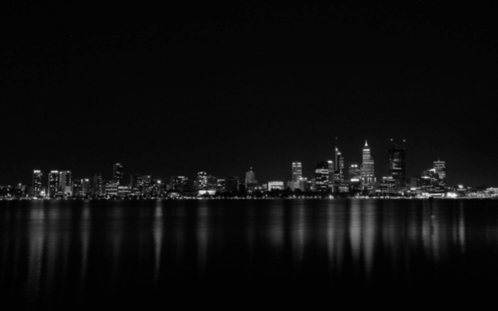
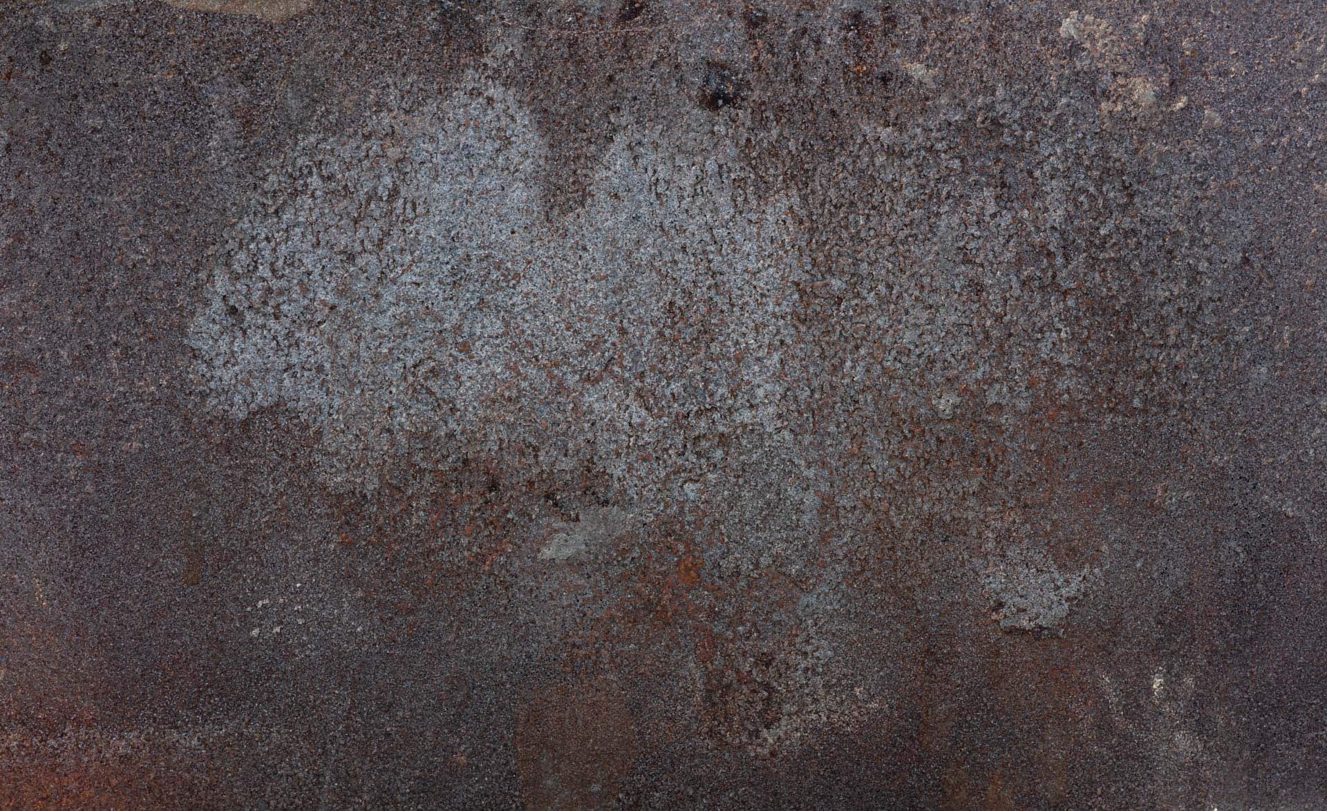
For the graphic its self. I immediately knew I wanted to reflect the brands urban, brutalist appeal with a dark city scape. I desired for the tone of the brand to not just be felt in the words, but from the imagery too. I also planned to layer the graphic with texture like noise and blur to evoke a subtle weathered feel.
-
For the design process, all typography was done on Adobe Illustrator, before I moved to the imagery in Photoshop. I ended up using an image of a skyscraper window, reflecting the surrounding city. I played with the color balance until I found a cool tone that represented the mood I wanted to evoke.
For the words, I aligned them to the perspective of the window, as if they were actually stuck to the glass, giving them an outer glow effect to create an illusion of light.


